


Beautiful web design doesn’t just come out of thin air, great web design comes from a carefully planned and thought out process that not only communicates a product or service but is functional, easy to navigate, communicates the right message and is as enjoyable as possible. To help make a website beautiful it is usually the case that a web designer will ( and should ) use an invisible grid system. In this blog post, we are going to discuss three ways you can use the grid system to create beautiful web experiences.
Human’s naturally look for patterns in things, it is believed to be the way to create perfect harmony in any visual design, for example, even mother nature, although seeming erratic and unplanned to the trained eye designs everything in a grid type system known as the golden ratio which can be seen in the likes of shells and leaf structures. The structure is incredibly important to the most beautiful design and luckily we have two websites that can give you a basis to start structuring your websites depending on what size grid you want to use.
960.gs website grid system
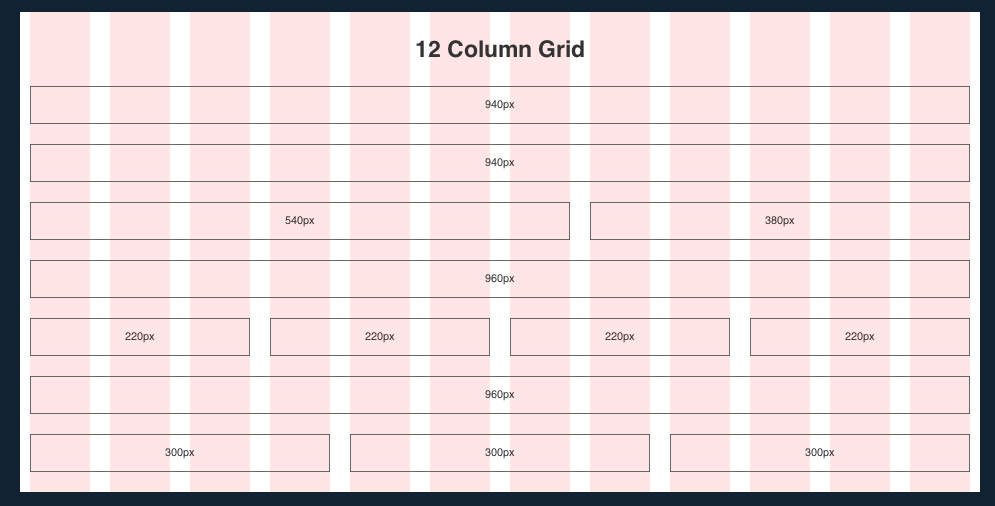
960 stands for the number of pixels that would remain fixed in a grid system for the largest resolution screen and thus a smaller width for the web designer’s that would prefer a larger white space for people with large screens. Several large blue-chip companies have applied this grid system to their website such as Sony music and Drupal the CMS system. Usually, these websites are broken down into either 12 or 16 column grid systems to help align web objects and images precisely creating harmony in design such as those seen below.
If you would like to use the 960 grid system then go to their website and click on their ‘Big ol’ DOWNLOAD button now! 🙂
1200px website grid system
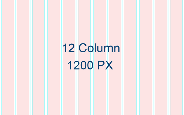
Most modern websites use the 1200px grid system when designing for full-sized screens as this now seems to be the average size of monitors, even so, you mustn’t disregard other resolutions as you want everyone regardless of the device to have a perfect experience on your website.
To help you make a decision if you want the 1200px grid system I would recommend considering what CSS3 media queries you would like to use and taking a look at this webpage about best screen sizes and judging for yourself the optimum resolution for your design. If you think that 1200px website grid systems would be the best grid system for your largest design size then visit the 1200px website to download their template in either photoshop, CSS or illustrator files to get your design underway!
Creating a baseline grid in Photoshop

So now have our grid system for the vertical system we still need a grid for the horizontal layout to ensure that we place things mathematically in perfection. If you are new to baseline grid systems then imagine ruled paper and how you had to keep your writing on the line. Remember how it all looked incredibly neat and organised if you kept your writing on the line, this is the same principle of a web design using a baseline grid, it helps you layout EVERYTHING with mathematical perfection.
Never forget the importance of the grid
Some designers don’t realise just how important a grid system is in helping people feel that the website they are on is structured and comfortable to use, this is just one of many things that should be taken into consideration when creating a professional website, as well as UX, responsive design, mobile-first design, accessibility design, graphic design, colour theory, website speed, animation, clever interactions…the list is becoming endless as the website consumers expect more and more from their experiences.
The grid is now fundamental to the first step of creating a beautiful design, how do you use the grid? Have you seen a great design that chooses to avoid it?
Do you want help creating a website view our web design services here.
Please comment below.