


When I was doing a piece of design work recently I had a conversation with one of my colleagues who was adamant that you shouldn’t use more than one font per design. Now I respect the views of others greatly, in fact, the whole point of the design is to delight others whilst communicating key messaging. But this way of thinking, can be very rigid and lacks room for creative freedom which is important when designing anything. How many fonts can you use in your designs? I believe, sometimes, more than two!
It could be said that a part of a lot of great design works, in my opinion, is experimenting and taking risks that others wouldn’t dare take. The true creative geniuses are the risk-takers, the dreamers and the deep thinkers that help others see things that they can’t see otherwise. Creatives challenge preconceptions of ‘what should be done and ‘what is expected’ to stir emotion and to provoke interest. In this blog post, I will discuss the use of fonts in design and the argument for and against using more than one typeface in design.
Traditional Rules
A lot of traditionalists out there are petrified by the idea of using more than one font in a design. It feels to them like dangerous ground, they worry that it may make them look unprofessional if the fonts selected by the designer clash or contrast and are afraid that it might put off potential customers from using their company. A traditionalist view can be summarized like that of an author at Leaf Digital: –
Fonts should be used consistently and in moderation. Generally, you should use a maximum of two typefaces on a page (one for body text and one for headings), except in special cases. Otherwise your page will look like a gaudy mish-mash of styles.
Wow! What an exciting way to design, never use more than two fonts in a design otherwise it’s a ‘gaudy mish-mash‘ of styles. We certainly know how this traditionalist likes their work designed and it isn’t one of taking risks.
The Brave Challenge the Status Quo
Beware of the designer who ALWAYS sticks to one font, they will lack the risk factor that great design requires and can be a warning sign that they are comfortable wearing their slippers under the desk rather than their adventure boots. A designer should always be willing to take risks, of which many are, but as we gain more and more clients, unless very lucky, tend to put a stop on our ability to challenge the status quo as Michael Wolff explains: –
There is a huge relapse into convention. Being risk-averse is a very comfortable place to be in. If you look around at the results of design, it is very placating – all about pushing the design through, getting the client to pay for it.’
Lots of clients, I am afraid, tend to be comfy slipper wearers but it’s not their fault really, they have a lot riding on the work we as designers create for them. As a client, you want a piece of work that ‘works’ and converts as many potentials leads into customers as possible. It is our job to convince our clients that going outside the boundaries of the traditional rule can sometimes be advantageous but how you do that is the challenge, how do you try and convince someone who likes rules to break them a little in the name of design?
How many fonts can you use in your designs? Remember, it’s about the journey
Each one of us has a story to tell and that is of the journey of our lives. These unique journeys mould how we see the world, what we see as beautiful, what we believe to be right and what we see as wrong and design has been hugely influential in this process and incorporated into every cranny of our lives.
Selecting one, two or more typefaces should not be simply because you are feeling like running some anarchy and just want to break the rules, hell no! It should be because it will help you tell a story, a story of your clients business or service.
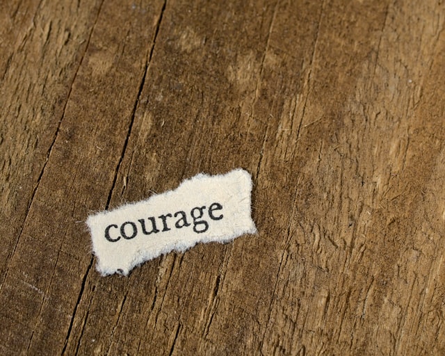
Each font has its own character and selecting the appropriate ones to use is down to the message you are trying to portray to the target audience. How many fonts can you use in your designs, it depends on your level of courage to break boundaries but also, what type of product or service you are advertising.
Being traditionalist has its place in design and I would definitely suggest that EVERY designer understands the rules of design before you go about trying to create ANYTHING. Here is quite a good article about typography in web design and most of the points are very valid to understanding some of the ‘rules’ so take a little look but I’m still not agreeing with the fact you shouldn’t use too many fonts, sorry! Just check out the example in the website image further down the post to show how it can be done and done well!
We need to know the rules so that we can break them without destroying our work. Once we know them that is when we can push, prod, squeeze and stretch our designs to show the unexpected. So next time you think about how many fonts can you use in your designs try and push tradition and convention. You never know, it may work.
Is it serving a purpose or purely decorative?
It’s not just about storytelling it’s about purpose. Just like art if a picture is excellently executed but holds no meaning or purpose then it simply is a pretty picture and pretty damn pointless if you ask me!
By using varying fonts, whether in weight, colour, texture, size or typeface can draw attention to it and can be useful when trying to draw attention to call to actions or for other design purposes. A different font in design can be quite jarring to some, particularly for those with more traditional views but for those who are a little bit more adventurous, it can stir the soul and bring life and movement to the content that was previously not there. By sticking to one font you are limiting what is possible, even Google themselves help in the selection of typefaces when using Google Fonts as they know that using more than one font can provide more interest and improve a website design than one with only one typeface which can appear flat, boring and lacking artistic talent.
I guess when designing for the web and selecting typefaces you really need to consider your target audience at all times. Are you trying to attract the creative types or they are methodical? Are you aiming your content at the young or the older? Keeping this in mind is important but I always recommend trying to push the boundaries from the comfortable and expected to the comfortably unexpected thus making the experience of design an adventure and entertaining. The problem with doing this is you can run the risk of being criticised but you need to be able to accept that if you want to try and challenge the status quo and be a designer of some merit.
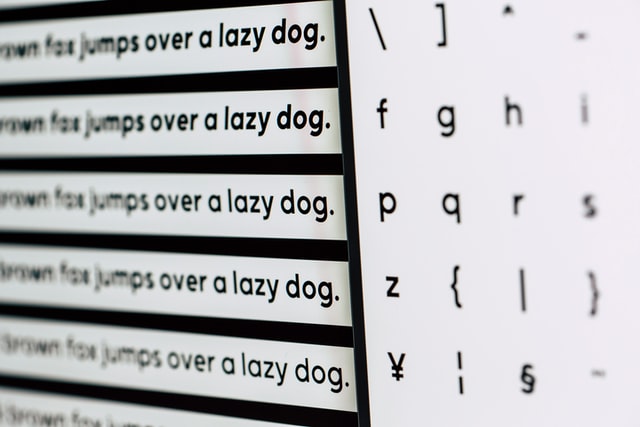
Examples of more than one typeface used
So finally I wanted to show a few examples of where different typefaces have been used, from social media, illustration and web design more and more designers are daring to use more than one typeface and I think, quite successfully.
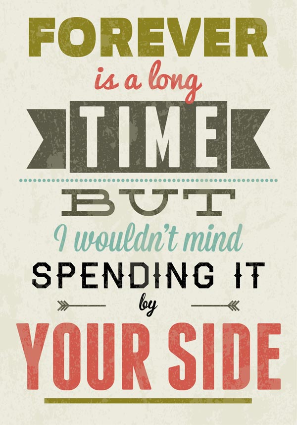
You can see from these images that using several typefaces creates visual movement, hierarchy and it feels more alive than the usual one or two typefaces so for a person of creative intent that enjoys the adventure in life it can be a design well done.
So how many fonts can you use in your designs?
“Rules are there to be broken” is the mentality of every great designer. No ‘true’ designer believes that he should always follow the straight line…well…maybe some do, the ones who want to play safe and guarantee money rather than great success, but the ones who create something truly awesome are the ones who are fearless in the face of adversity, difference and brave enough to challenge preconceptions.
In conclusion, I believe you should learn the rules, practise them even and then bend them till they are almost at breaking point.
I don’t believe that two fonts at most are a MUST as that’s not a very creative way to think, experiment and make several versions of your design, one with more than two fonts and the other without and see what works best, you never know, you might find something that your client truly loves and that is truly what being a good creative is about, showing people things they never expected and mesmerising them.
Enjoy! 🙂
Places to get free fonts
Lastly, for taking the time to read through my theory of typography I am sharing with you a previous blog post I created about where to find some websites to get FREEEEE fonts, enjoy! 🙂
Another blog post about typography
What are your thoughts on typography? How many fonts can you use in your designs do you believe? Have I rattled some cages? Please feel free to leave your comments in the box below.
Need help with graphic design? Visit our digital design services to see how we can help you.