


Creating a colour scheme for your brand should not be taken lightly, colour has a huge psychological power over its viewer than has been with us in nature from the beginning of time. It’s not simply saying ‘I want it to be yellow’, you need to consider what shade of yellow as a vivid bright yellow has a different feel, mood and meaning than a dark mustard yellow. Here is some basic information about the meaning of the main shades of colour.
The meaning of colour
Local culture, past experiences and the human subconscious are what give the colour its meaning. It could be said that colour can mean different things to different people due to their own life experiences, for example, I knew a man who hated vibrant red because he felt it looked cheap and nasty due to his bad past experience with a well-known electronics shop that gave him poor customer service whereas the next person loved that colour because it represented his favourite football team which connects with a feeling of euphoria and belonging. These are cultural and life experiences that have positioned them both in certain ways of thinking about colour.
Human beings also have some natural subconscious meaning for particular colours which are briefly explained below.
Red is a colour of intense passion and can generate strong emotions as well as being a colour of danger. It can be romantic and symbolize love but it can also symbolise a danger, i.e. ladybird is red to tell others not to eat it and avoid it entirely. It has been proven to encourage appetite, which is why you’ll notice so many food brands and restaurants use it in their colour palette.
Orange is the colour of social communication and also excitement, humour, and enthusiasm. It can communicate warmth, friendliness, and confidence alternatively it can also represent superficiality.
Yellow is usually perceived as a happy, cheerful colour. It increases warmth, stimulates mental processes, and also encourages communication. It can be seen as the colour of the mind and intellect but also of cowardice and impatience.
Green has been used often to symbolize healing, tranquillity, nature, and growth. Sometimes it is also used to symbolise wealth.
Blue is the coolest colour on the colour wheel and can represent inspiration and is associated with calmness, peace, and water. It is said that Blue can have the effect of curbing appetites. Others say can improve productivity and perhaps this is the reason why it’s the most used colour for officials and administrative offices.
Purple is said to symbolize royalty, wealth, success, and wisdom. Depending on the shade, purple can also be used to calm or soothe. It’s used often in beauty and anti-ageing products.
White is associated with purity, innocence, and cleanliness. It can create balance and openness to designs, but can also be seen as cold or sterile – depending on how it has been designed to be used. White is usually found on designers’ websites so that their works can be the pieces that add colour and draw attention to their portfolio.
Black is perceived as dark or sleek but can be a difficult colour to work with. It is associated with death and something hidden but can also be used to represent power or edgy, someone with a different attitude towards the norm.
Silver is a metallic colour, associated with technology. Several jewellery and technology companies use silver for these reasons, as it relates directly to their products and services. It can also be quite clinical looking so may be found in combination with other colours in the health care industry.
Gold, since a very early age, has always been associated with luxury, as well as glamour, wisdom, and royalty in the human psyche this is due to the precious metal being used for the wealthy and rich for many many years. The difficulty with this colour is that if you use too much of it it can look tacky so be cautious when using this colour.
Remember when choosing a colour don’t simply choose it because it’s always been your favourite consider its implication on how the colour may make you be perceived by your potential market.
Exact match to a particular colour
When choosing the main colour of your business with a designer it is important to not just say ‘red’ or ‘blue’ etc as there are so many shades of colour, in fact, there are around 10 million colours that we can see with the naked eye so stating a ‘general’ colour is a little bit unspecific, instead, find an image of the colour you like and send it to your designer. They will be able to find the RGB, CMYK & Hex code of your chosen colour so you can make sure you always select the right colour as you take your business forward.
Combining colours to create a colour scheme for your brand
Once you are set on a particular colour you want to know what colours work well with the one you have chosen. You can do this by using colour scheme creators and selecting monochromatic, polychromatic, complementary, triad, tetrad or analogic colour combinations. Bit confused about what all these mean then let me explain the basics: –
Monochromatic
The monochromatic colour scheme is very easy on the eyes as all the colours are different hues and shades of the same colour ( as can be seen in this yellow colour below ). It can be useful to establish a certain mood and can work well with neutral colours such as black and white but for web design, in particular, it’s not necessarily an ideal choice as nothing will stand out when you want to create a call to action. For instance, a green button on a predominantly green website will not draw the user’s eye so less likely to click on the button.
Polychromatic
Polychromatic is a colour scheme taken from all over the colour wheel with no pre-defining colour scheme, the word ‘poly’ meaning many. Saying this the scheme must be pleasing to the eye and have over 5 colours to be defined as a Polychromatic scheme.
Complimentary Colours
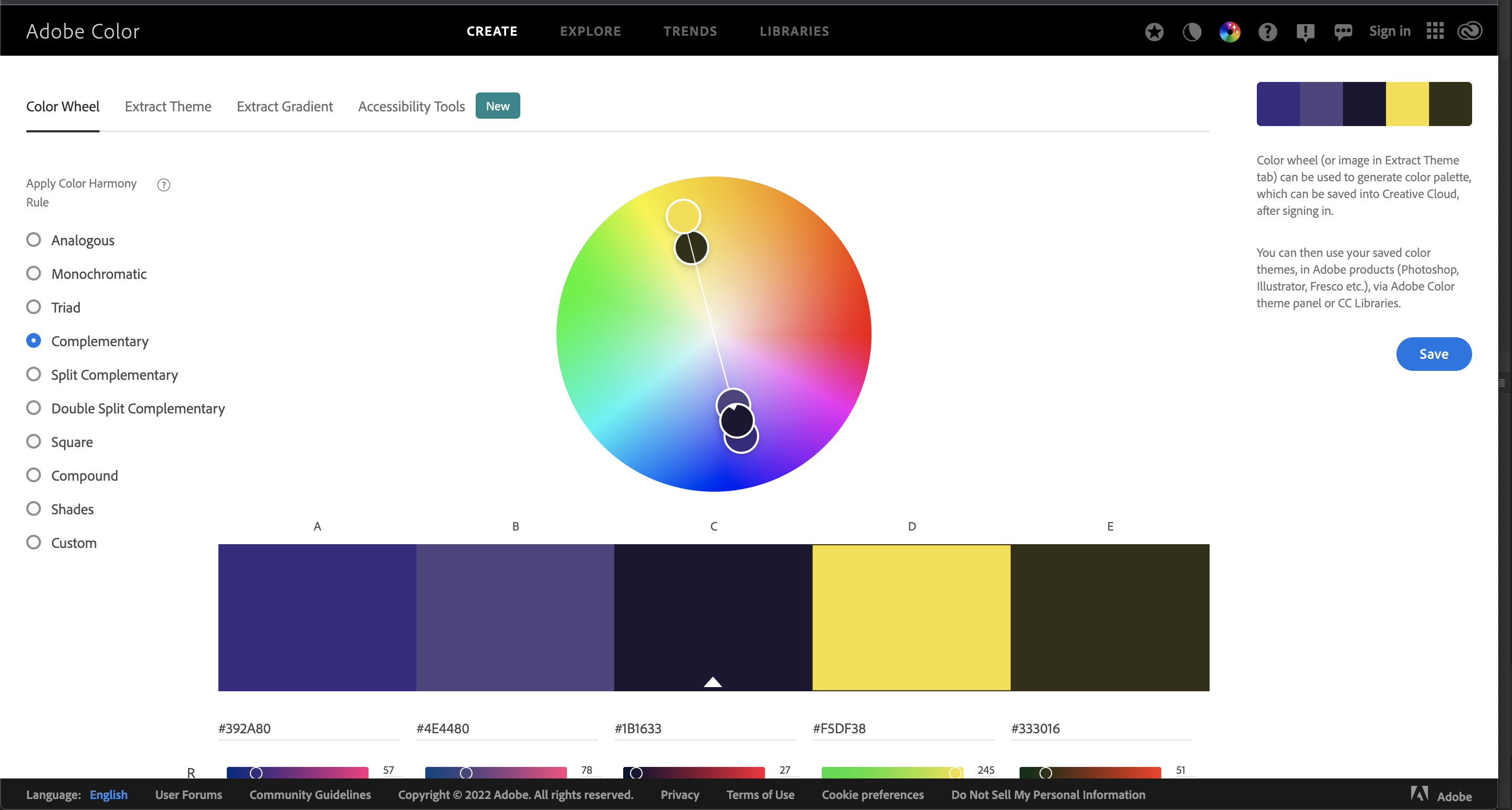
A complementary colour scheme is just that, complimentary. A complementary colour is one that is directly opposite on the colour wheel ( see image below) meaning they have high contrasting hues. This colour scheme tends to work well with web design because it is much easier to draw attention to specific elements for use in call to actions features.
Although complementary colour schemes are good for web design it is important to remember to select one colour as the dominant colour and the secondary colour just as an ‘accent’ or ‘attention grabber’, if you balance the colour scheme too much the two colours will not have any movement.
Triad Colour Scheme For Your Brand
Triad, meaning three, uses three colours equally spaced around the colour wheel ( see above ). This scheme is quite popular for artists as it has strong visual contrast while retaining balance, and vibrant colours.
This use of a colour scheme can be more balancing and harmonious than using complementary schemes as well as offering the option of choosing two prominent colours for the style of the website you are creating and one for the call to action.
Analogic
This colour combination uses colours that are adjacent to each other on the colour wheel and usually one colour is dominant and the others are used to complement the main colour. When selecting colours for this colour scheme avoid combining warm and cold colours unless intentional and try not to use too many colours otherwise it may destroy the harmony of the brand.
How to choose a colour scheme for your brand using online colour mixing tools
Now you understand the basic meaning of colour, are aware of how cultural differences and experiences affect how we feel about a brand and have an understanding of different colour combination terms you can generate some colour schemes using a designer provided by Adobe or a great alternative version by Petr Stanieck here.
Lastly and probably most importantly, don’t forget to take note of the HEX code, RGB and CMYK values and jot them down. A slight misuse of colour in your brand will make you look inconsistent, amateur, unprofessional and cheap, the last thing any business wants to appear.
Best of luck in designing your colour scheme for your brand and remember, don’t necessarily select your favourite colour select the colour that resonates with your target market.