


The colour blue is a colour that embodies communication, authority and trust. It is a colour that can bring inner security and confidence and allow you to take control and do the right thing in difficult times.
In this post, I will look in-depth at the meaning of blue, how different shades have different meanings to us and when we should consider using the power of blue in our branding.
Blue and its meaning in the colour of the throat chakra – intuition
Why am I talking about chakras and what is a chakra? A chakra is what is known as an energy wheel that helps make up our spiritual aura ( that can be seen by the use of special cameras) of seven colours. Red, orange, yellow, green, blue, indigo, purple and gold/white. It is believed to relate to how we think and how we experience the world, how people see us, as well as our physical and mental health.
Each chakra has a purpose beyond its colour and the throat is believed to be the chakra of communication, creating and manifesting.
It is believed to relate to how we express ourselves through creative endeavour, how we speak ( or choose to suppress ourselves ) to another, which in turn creates how we experience the world around us. When in balance it allows us to take responsibility for our own needs and create the world that we envision for ourselves and gives us conviction of our actions. This is the essence of blue in our spiritual being which gives us an inclination of when we might want to choose to use the colour when communicating a brand message, one that relates to communication, authority, trust or something that empowers people to take action for the betterment of their life.
If we consider a business that already uses blue successfully in their branding we can see how the chakras purpose plays a part in the selection of the colour. Banks famous like Barclays, Royal Bank of Scotland, RBS, Halifax, American National Bank and TSB all use the colour blue for their main brand colour and they use it for the reasons expressed above. The message that this provides their customers is that they are an authority, trustworthy ( regardless of what we actually know! ) and will help you manifest your dreams into reality.
To re-enforce this idea that blue is authoritative and empowering we have to look no further than The Whitehouse, arguably the most powerful government body in the entire world!
The colour blue in nature
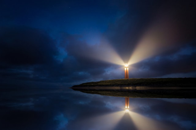
The colour blue in nature is the colour we most associate with both the sky and the sea both of which give us a sense of movement and forward-thinking.

You may notice when the sky is blue without a single cloud in the sky you feel more uplifted and optimistic you are going to have a good day. This is not a coincidence, a bright blue that predominates your vision on a day like that is mostly what you see and will have a subliminal effect on your way of thinking.
Water also appears blue to us but only due to the fact that water refracts light and blue is the quickest colour to leave the water and return to our eye whilst other colours are absorbed more quickly as explained here by Scientific American : –
“The ocean looks blue because red, orange and yellow (long-wavelength light) are absorbed more strongly by water than is blue (short-wavelength light). So when white light from the sun enters the ocean, it is mostly the blue that gets returned. Same reason the sky is blue.”
Water is the giver of life to all things so this relates to how we can allow our visions to also come alive.
The bad side of the colour blue
Blue can often be seen as conservative, a colour that doesn’t like change, predictable and pretty rigid or even depressed so it is important to mix this colour with another such as optimistic yellow or healing green otherwise it can bring on a stubborn fearful nature and make you a little too risk-averse as well as possibly becoming fearful and feeling misunderstood.
The colour blue and its cultural representation in different countries
Culturally speaking the colour blue has vast differences depending upon where you are from. For the western world, it means boys and as you see many banks use it to evoke trust.
In Scandinavia, it has been associated with cleanliness, probably due to its association with water and in eastern Europe represents good health.
In the East, China sees blue is seen as the colour of immortality whilst India relate it to Krishna. Interestingly in South Africa blue is the colour of happiness rather than yellow and Nigeria see it as a very positive colour!
Blue, globally is seen as the safest and most positive of all colours to use in branding but speaks of ‘conservative risk-averse’ companies than ones of character.
How blue can affect our mood
Blue as already discussed, helps us to communicate clearly with confidence and vigour and builds trust and loyalty, but when it has negative connotations it can make us ‘feel blue’ , scared of change or difference, unforgiving and spiteful.
Shades of blue
Although all that I have spoken about here is a holistic view of blue, blue has many different variants of its colour combining it with the pigments of other colours. This website by colormatters with colour psychology explains some of the shades of blue and their psychological meaning in more depth.
With the colour blue, you should use it for a brand that sells services that require trust and/or loyalty, a company that communicates or sells products that empower you to move forward or have your say.
I hope this brief article about the colour blue has been useful, do you have any other points that you think may be useful to someone thinking about using blue in their design work?