Are you a therapist wondering what makes a good therapist website? It can be difficult to know where to start when you are building your online presence and knowing how to improve it. Perhaps you don’t have a website but are considering building it yourself through a drag and drop builder, or maybe you are considering hiring a professional? Whatever your situation, in this article we discuss ten of the top tips to build an amazing website that helps you and your users!
What makes a good therapist website?
1. Simple intuitive navigation

When someone is seeking therapy they want to navigate through websites as easily as possible.
Your main menu shouldn’t be difficult to understand or navigate and likewise, your page layouts also need to be carefully thought out. There are certain things to consider to make it easy for users to know how to find the information they are looking for on your site.
For example, if you are a hypnotherapist then maybe you would have a top-level navigation page called ‘hypnotherapy’. A drop-down could then have various different types of hypnotherapy below it.
Likewise, another top-level menu item could be called ‘we can help with’ with a dropdown menu of conditions you can help with.
Also, there is quite a lot of importance put on ‘above the fold ’ content. This is the part of what people see first before scrolling down. By placing key links and pages here it can make navigating the site easier. In fact, it is this reason why large sliders are not always the best solution.
What makes a good therapist website? When designing your navigation be sure you ALWAYS keep in mind the ease of use and what you want to communicate to visitors.
2. Breakdown text with the use of headings


A common theme I see with therapists is that they are absolute experts in their field but often unsure how to layout text on a website.
The way we read websites is very different from how we read a book. It has some similarities to newspapers in the fact we tend to scan headings and if interested, we then choose to read more.
It is good practice, like this blog post actually, to break up your text with headings. This heading describes what information a user can find in the paragraph they are about to read. It is important, like the navigation, that the information they are looking for is easy to find.
Contrary to what some designers will tell you, having lots of text is a GOOD thing IF designed well. Text content can help optimize your website for search on Google and Bing. The key aspect is to ensure your layout of the text well and make content easy to skim read. If you have very long paragraphs, very few people will bother to read them.
What makes a good therapy website? Well structured content with headings.
3. What makes a good therapist website? Well designed call to actions
All good websites have call to action features. Believe it or not, users don’t always know what to do when they land on a webpage and need guidance. They have a problem but don’t necessarily know how you can provide the solution. That’s the job of your content and your call to action!
Your web pages need to be well written to describe your service or product, to inform the reader, but then, once read, they need to be enticed to take action.
Simple examples of call to action include buttons with book/buy now, a compelling statement with a link or a contact form all provide ways for users to ACT. This is the thing you want your users to do the most, to act. Yes, you want to help and educate them, but you also want new customers.
There are many ways to add a call to action to your web pages but is vital to generating new leads.
4. Responsive website design
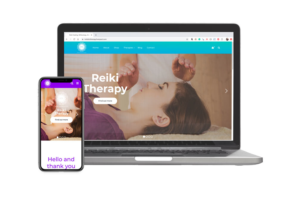

Does your website look beautiful on all devices and easily readable? Does it have the same aesthetic power on a mobile device or tablet as it does a desktop, or does it seem as though you have just squeezed the design into the viewport rather than carefully thought it out?
Responsive design isn’t just about making it fit as many amateur web designers may make you believe. A GOOD responsive design will consider how the user will experience your website on smaller devices not just make it fit. With modern technology, it is entirely possible to rearrange the layout for different devices so that key calls to actions are not lost.
For example, a telephone number on a desktop can be changed to a simple telephone icon that when clicked, dials the number from your mobile phone!
Another example might be that maybe you have a hover effect on buttons on desktops but how do they work on mobile? Can you create an interesting experience that provides the same level of interaction?
Are all images necessary on mobile or could some be hidden?
These are all key questions a good web designer will consider when designing your website.
5. Think with a mind of ‘solving problems’


The great thing about being a therapist is that you help solve a lot of people’s problems every day so you are good at this part! When writing content you don’t write with yourself in mind. Your website content should be about your user’s problems and the solutions you provide!
As harsh as this may sound, a client doesn’t really care about you, as such. All they care about is do you have the experience and qualifications to help them solve a situation in their life ( although they may also think, do I want to work with this person? ).
When writing content thinks about the therapy you provide, describe it, and how it can be helpful in resolving different issues someone may be having. All great salespeople are great problem solvers!
What makes a great therapist website? A site that provides solutions to many users’ problems. Don’t just describe the service, solve the problems!
6. A little bit about you
Although a user will mostly be looking for solutions to their problem, they DO care about your background. They need to be able to build trust if they are to seek relaxation and potentially discuss their issues that may be very difficult.
I often recommend therapists discuss their background, sometimes even mentioning why they were drawn into therapy in the first place. This honesty combined with your professional qualifications and experience gives users the confidence to make an inquiry.
If the potential client feels they can trust you, and even have some empathy with what they have experienced, as well as being professional, this removes barriers to making the brave step to seek therapy.
7. Qualifications & Testimonials


This leads us to the importance of displaying your qualification and testimonials.
Potential users want to know they are dealing with a professional when getting help.
Qualifications and bodies you are registered with can all help ease any concern someone may have before booking you.
Testimonials are fantastic ways of also building an extra layer of trust. Yes, many people know that fake testimonials can be created but even so, the use of testimonials is proven to help improve the trust someone will have in you.
It is worth also asking your previous clients whether they will leave you a testimonial and review on Google ( if you are registered ). All this will help build your authority as someone who can help with their issue or concern.
8. Uncluttered, modern, and relevant design


An easy to use site is well designed and uncluttered when it comes to a therapist website. Small paragraphs of text with headings. Well-chosen images that aren’t cliche and enhance the written content. Colours and fonts that communicate your key marketing messages. Well-selected animations that enhance usability rather than being distracting. These are just some pointers to what makes a good therapist website.
9. Displaying prices, booking, and paying for therapy online.


Our 9th top tip for your therapy website is the inclusion of booking calendars and payment gateways. People are becoming more and more used to paying for everything online or with no cash. The ease of looking up your availability and selecting the time they want can empower a client.
Although you must manage an online calendar, it can assist in organizing your time and give clients the power of choice and control over their payments.
Having a booking calendar also means you have to display your prices. Shock horror! :O
Believe it or not, this is a GOOD thing! How many websites have you been to where you have to enquire or put in your email address before you can see the price of a product or service? Frustrating right? Potential clients feel the same! Don’t worry about what your competitors are doing, there will always be people more affordable, those more expensive. It is about recognizing that your competition is providing the same service but in a different way.
Recognize your unique selling points and understand your key market and you will soon find displaying prices is another way of easing any tension a potential client may have.
10. What makes a good therapist website? Having contact information easily reachable
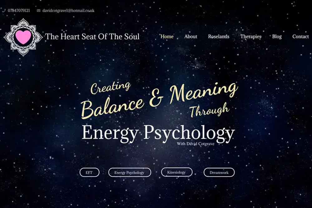

Last but not least, is your contact information. Your contact information should be easily reachable and ideally always on-screen wherever a client is or at least in the heading area and footer. If you don’t have it in these areas then it needs to be easily identifiable how to contact you via the contact page.
Potentially even include your address with a button or link to ‘get directions’, so again, your client has all the stresses and strains taken away from seeking therapy and attending your studio.
The conclusion to what makes a good therapist website?
These are just some of the ways of what makes a good therapist website and you can implement some of them into your next project. Do you have any other suggestions? Please leave your comment below.
If you are in the process of considering getting a website and need help with building one or redesigning your current therapy website we can help.
See our custom pre-made web design services for as little as £15.99 per month or our bespoke services. The bespoke service means you get a custom made website designed by an experienced UK designer/developer, exactly as you envision it, designed, hand-coded and tested from as little as £799.
Did you know we also run a FREE therapist directory with over 1100 registrations? Sign up here to be a part of the growing network of therapists at Seek A Therapy.

