Case Study

MigSolv

Who are they?

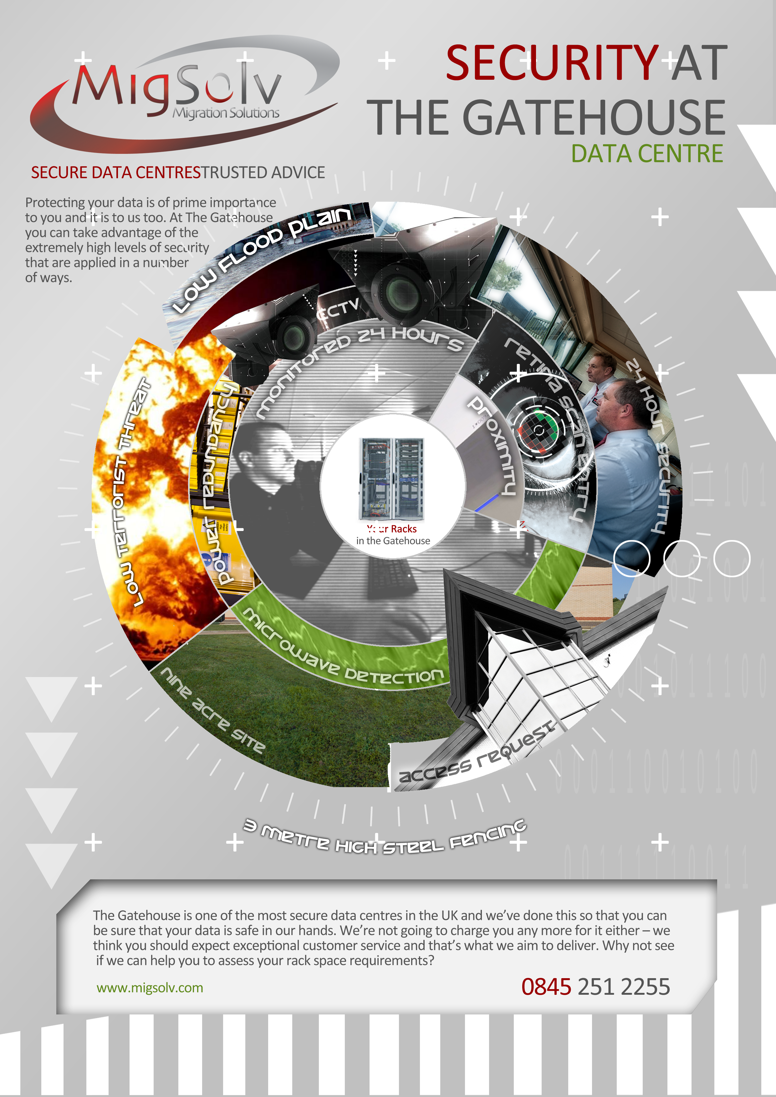
MigSolv was established in 2002 as the only UK consultancy to specialise exclusively in Data Centre environments. "The Gatehouse" Data Centre in Norwich is one of the most secure data centres in the UK. Formerly known as Migration Solutions data centre consultancy and Sentry42 data centre prior to its rebranding in 2011.
Unfortunately, MigSolv entered administration in winter 2019.

THE CHALLENGE

MigSolv, prior to The Change Creatives input, was known as Migration Solutions consultancy & Sentry42 data centre. After two years and careful consideration, it was under the belief of both the CEO, operations director, and the new investor that they should attempt to rebrand the two sectors of the company under one new identity rather than two.

NEW VISUAL IDENTITY

We were tasked with amalgamating the two sides of MigSolv’s businesses together in a careful rebrand working closely with the CEO. It would begin by designing a new visual identity to help bring consistency to the branding and pursue a direction with the stronger and more well-established data centre consultancy Migration Solutions.

WEB DESIGN

Upon completion of the visual identity element of the brief, we then were assigned the design and build of all the collateral and website design to represent their services. Aligning the site with the newly developed visual identity, and clearly presented to site visitors the core services of the company’s values through various means.

The website needed to be fully responsive across desktop, tablet, and mobile devices and also, be SEO optimized.

THE SOLUTION

The core focus was to amalgamate and modernize the business brand. Once the logo and collateral had been carefully redesigned, we swiftly moved onto the design of the website to ensure that the content of the website was structured in a logical way to meet audience information needs and the organisation objectives. Propositions and key messages were articulated in a clear and concise way in various communication styles. The design answered organisation objectives, met users’ aims and the website was search engine friendly.

This was achieved through the following ways:

  • Revisited both logo designs and kept recognizable brand shapes rather than totally redesign the original logos to maintain recognition in the industry.
  • The website engages with the various target audiences and organizations that came looking at MigSolv being accessible and offering information about services in a clear and logical way using various visual cues such as bespoke icons and illustrations.
  • The responsive website presents attractively and functionally to users independent of the device they arrive at the website on – eg. mobile, tablet, or desktop.
  • A brand style guide was developed to ensure the brand was refreshed across all channels, print and digital.
  • The website is built using a CMS with fully trained staff and ongoing support.

Branding

Branding MigSolv

One of the most challenging elements of the rebrand was that the investor didn’t want to lose any of the credibility of the business already established. Migration Solutions had been established for over ten years and was well recognized amongst many industries, the CEO had other ideas. He wanted to get away from the ‘men in grey suits’  impression and to become more of a forward-looking business. To do this, it was suggested at first to attempt to make the industry more humanized by introducing modern imagery and potentially adjusting the colour scheme to be less cold and more vibrant.

In a further development, we suggested to include actual photography of the people who work for MigSolv and also, add stylised characters to various elements of their brand to further communicate the friendly and approachable nature of the people of MigSolv.

Logo Design

A careful rebranding of the logo was one of the most challenging elements of the brief. The investor didn’t want to lose the well-established Migration Solutions logo recognition. Due to this, we applied a similar look but with a more modern style to the rebranded design.

This simplification of the logo was to appear as a more modern, forward-thinking, and technological brand.

Now I had a name, the real stage of design could begin…we decided the new logo had to make use of modern typography and gradient elements. We replaced the burgundy for a more vibrant red and white for a more metallic grey. The top loop represented the technological aspect of the business and the red, the modern business approach to data centre management. To appease the CEO and investor we kept the Migration Solutions reference just below MigSolv until it built larger brand recognition within the industry was established.

MIGSOLV ‘O’

Also, as part of the rebranding process, we decided that the o would be an element of the logo that could be altered and rebranded to represent/ or express an idea, event, or occasion see the example below. Following this, the logo also became Migration Solutions consultancy entirely as the CEO decided that he wanted similarity in the brand but the ability to interchange between MigSolv and Migration Solutions when he felt suitable to do so.

Website Design

Website Design

The MigSolv website has changed guise twice whilst working in-house for the business. Initially, the brief was to keep the website minimalist, white, and silver until we realized the bounce rate appeared to be quite high. Considering this, we redeveloped the website to use large imagery with a parallax capability website with a modern abstract feel to it in early 2014.

The homepage can be seen below. Artistic, stimulating, friendly, and modern were the buzz words behind the initial concept whilst the incorporation of the green with the red and green became enforced in mid-2013.

bespoke wordpress website by The Change Creative

Icon Design

Lorem ipsum dolor sit amet, consectetur adipiscing elit. Aliquam lobortis leo ut sem aliquam volutpat. Pellentesque at tempor nunc. Fusce placerat leo sit amet arcu dictum, vitae dapibus augue sollicitudin. Ut magna arcu, imperdiet ut consectetur nec, dapibus quis neque. Vestibulum vel nisi ut dolor commodo lobortis eget semper dui. Phasellus rutrum pulvinar ipsum tempor ullamcorper. Pellentesque iaculis sem a eros convallis egestas. Etiam vel arcu semper, facilisis urna vitae, imperdiet velit. Nulla ut orci justo. Praesent porttitor consequat dui quis hendrerit. Nulla convallis facilisis odio. Pellentesque malesuada congue posuere.

Print Design

Bespoke High-Quality Conceptual Business Card Design

Bespoke High Quality Business Card Designs By The Change Creative

After the logo design, a business card was next on the agenda. A business card is often the first point of contact for new clients and I wanted the business product and ideology to be reflected in this. A data center company that has environmental principles and is dedicated to keeping customers’ data secure a mock security card was used as the design for the card.

Produced on biodegradable plastic the card will degrade much quicker than a standard plastic card once thrown away demonstrating the care that MigSolv has for the planet. On the reverse (hover over the card to see the reverse side) is a QR code containing all the information about the person. At the time this was the state of the art in technology and showed the forward technological thinking of the company.

Branded Stationery

Next was the stationery design. As the CEO wanted the stationery to be easily printable directly from Microsoft Office, again, the design was a little restricted but with a direction of minimalism and the use of a faded grey border, it reflected both the business card and the logo and the grey lines represented the lines of computer chipboard whilst offering some decoration.


Magazine Adverts

The magazine adverts have varied greatly throughout the years and have often reflected an evolving brand throughout the years.

It is clear to see from the adverts below (displayed chronologically) where things have changed and what direction the vision of the CEO wanted.

Exhibition Stands

The first exhibition stand followed the red, silver and white of the original brand using the loop to put the data centre facility in the centre of it whilst placing it onto a largely white backdrop. A year (Mid 2013) or so later the CEO wished to include green into the brand and this started to be reflected in both the exhibition stands, the magazine adverts and the large exhibition stand which can be seen below.

Informational Handouts

The handouts of MigSolv followed a similar style to the website using the grey and red of the brand and symbols found on the website.

The principle was to have simplistic but industrial-looking downloadable sheets to portray a technological company, John suggested that it was very important to reduce the amount of text on handouts and retain more information on particular webpages which was adhered to for some of the downloads such as Coloflex and the wholesale data centre as can be seen below.

MigSolv Informational Handout Collatrel design by The Change Creative

Digital Design

Infographic Design

As the design progressed we suggested creating some infographics to keep on trend with the latest marketing expectations. Below are two of the infographics that were created for MigSolv to represent just how secure rackspace and data is in the MigSolv data centre. The first was for display on the homepage of the main website and the second a concept for download as a handout and use on social media.

The second infographic has all of the aspects of the data centre inside a circle, a shape with no corners or bends, an unbreakable shape representing the strength of the security principles in place at the data centre and the customers racks in the centre.

Data Centre infographic design by The Change Creative John Wilson

FLASH MOVIE ADVERT FOR DATA CENTRES MONACO CLOUD EVENT

MigSolv required a moving advert for the reception of the Monaco Data Centre Cloud Event they had acquired. Using Flash CC we used the latest slogan that our external marketing agency provided of ‘Evaluate, Improve, Control’ displaying both the fact MigSolv is a data centre and a consultancy. Below is the still of the beginning of this design.

The Change Creative Triangle

Like What You See?

To discuss your project and see how we can help

Contact Us