Case Study

Holistic Therapy Liverpool

Who are they?

Holistic Therapy Liverpool is an established holistic therapy practice based in Woolton, Liverpool. The practice offers reiki, reflexology, Indian head massage, and various other holistic treatments., to allow her clients to reflect, rewind, and relax.

THE CHALLENGE

Holistic Therapy Liverpool had been running their business for over five years before approaching The Change Creative about their website. They hadn’t really paid much attention to their website design or branding and had just purchased a standard template to start them in the digital realm. They called upon our expertise to help make their brand consistent, professional, and easy to use.

THE SOLUTION

Holistic Therapy Liverpool needed some assistance in setting up a website that clearly defined their services and kept navigation simple. Their current site was a bit confusing and so the first step was to look at their navigation. Secondly, they also wanted a logo design creating to reflect their service.

Holistic Therapy Liverpool’s original website was confusing. Its menu was difficult to navigate and the homepage didn’t really communicate their services. We assisted HTL by bringing a clearer message and stronger branding to help push their business to the next level.

This was achieved through the following ways:

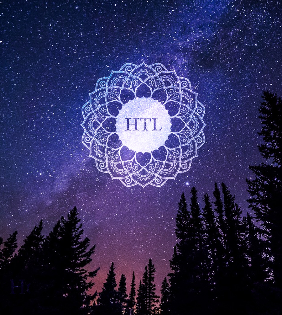
  • Develop a brand that would be based around the idea of the universal force that Reiki master’s use during their therapy and also the chakras.
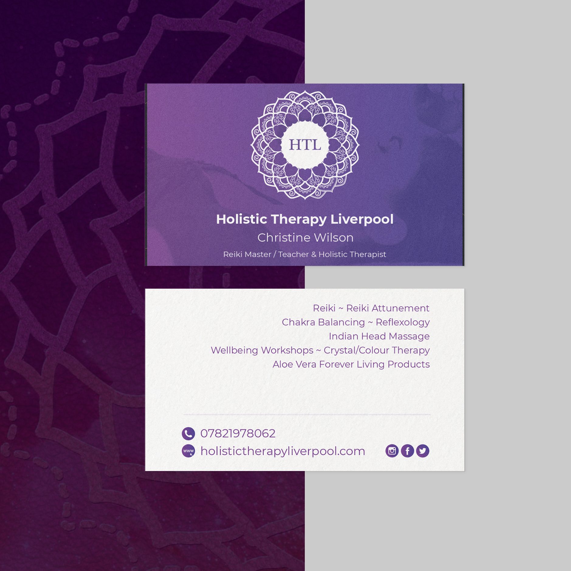
  • Design a logo that clearly communicated the type of work they undertake
  • Design a simple brochure website with consistent layouts and messaging, visually and written.
  • Design bespoke business cards with spot UV and embossed printing.
  • Design and print Chakra balancing cards.
  • Create an e-commerce platform for HTL to sell their wares and take payment for therapy online.

Logo Design

A logo is a very key part of all of your branding, some would say it is the heartbeat that drives all other elements of design due to it appearing in most places. It was for this reason that the client asked us to create a timeless design.

After discussion with Christine, it was agreed that we would look at the symbols of the chakras and use them to create an identity for the business as it is the core service provided.

The highest chakra is the crown chakra and believed to be the source of energy that helps to undertake Reiki healing. It is this energy used to heal others and why it felt appropriate to use it for their logo. The crown chakra is symbolized by the flower of 1000 petals and why it looks quite floral.

In the center of the logo the initials HTL.

We chose white on purple as this also corresponds with the chakra’s colour and on light backgrounds, the logo would be a deep purple.

Website Design

WEBSITE DESIGN

As mentioned, some web presence had already been established but it needed a clearer focus and a more professional image. Whilst keeping branding in mind, the key to the success of the navigation of this website would be to make it easy to understand what services are provided. We reworked the website so as soon as a potential customer lands on the homepage they know of the core service that HTL provides, Reiki.

As you scroll down the page a short introduction is followed by further services to let customers know if they are in the right place or not.

We decided to keep the menu simple and traditional whilst adding a twist of modern technological techniques. The menu bar navigates through all of the chakra colours whilst a user is browsing. A simple design idea but effective.

Image Selection

Image selection was important too. We wanted to provide people with a sense of peace and wellbeing and to help re-enforce the messaging provided in the text. We looked for images that aimed to communicate the benefits of seeking Reiki treatment.

Shop Inclusion

After some time, it became clear that some clients wanted to pay online rather than use cash and also, Christine had plans to sell wellbeing products on her site. We helped add an e-commerce element to her store and take payment through Stripe and/or PayPal, depending on the customer’s needs.

bespoke wordpress website by The Change Creative

Print Design

Business Cards

Once we had established the website design business cards were required. Again, they had produced some basic business cards with a well-known template printing company but they now wanted something that tied their brand together more clearly.

Bespoke Business Card Design

We chose to use a subtle image of a woman receiving Reiki overlayed with the new HTL logo. On the reverse of the card, we kept white so if need be, it could be written on. The client requested to also include her services in case someone wanted to know what she did without having to visit her website.

The card quality and printing methods we decided to chose would reflect the new professionalism that the website and logo provided. Spot UV on the logo to make it shine as it is handed to a client and a fairly thick card to reinforce the ‘quality’ that HTL provides in its holistic services.

 Chakra Balancing Cards Design

One of the products that HTL wanted to sell was Chakra Balancing cards. She had a clear idea of the product she wanted to create and so asked us to provide some designs whilst she provided the text. These cards contain affirmations and chakras on the reverse side in each of the corresponding colours. It is believed that repeating the affirmations whilst holding a specific crystal can help rebalance a chakra that one feels is out of sync.

The cards we designed can be seen below.

The Change Creative Triangle

Like What You See?

To discuss your project and see how we can help

Contact Us