Case Study

EDCG

Who are they?

In 2015 several data centre companies started discussing an idea to work under one new identity to be able to bid for larger client jobs but also to offer their clients the opportunity to place their equipment into two data centres owned by different organisations making their business safer should the worst happen. The first stage of creating the EDCG brand was to create a logo based on the idea of a strong partnership and ideology.

THE CHALLENGE

The EDCG concept was created by the managing director of MigSolv, Alex Rabbets. He asked me to come up with a new brand, website, PowerPoint and some collateral to share the idea with the other data centre owners.

THE SOLUTION

NEW VISUAL IDENTITY

The starting point for the whole brand would start with the logo. A new identity to communicate a strong partnership and modern forward-thinking organisation. This design would then direct a consistent brand throughout all the other marketing materials.

COLLATERAL & WEB DESIGN

Upon completion and approval of the new logo, we then were assigned the design and build of all the collateral and website design to represent their offerings.

Logo Design

The Inspiration

To begin, I had to consider how to make the EDCG brand look innovative, modern and something that people would likely want to be a part of but the data centre industry had built up a reputation for being a bit of drab affair of men in grey suits and not young, hip or at all rebellious but the movie industry had begun to change this. At the time of designing the logo a few years, previous Tron Legacy had been released which helped in changing the perspective of the industry from outsiders. Riding light cycles, neon colours and a feeling of something larger than ourselves came from this film. This film would form the basis of progressing with the EDCG logo design.

Logo Design

To begin sketching ideas I came up with the concept of the need to represent the strength or unity of 5 data centres coming together to create one business association. I looked into geometry and also into computer chip-boards due to their sometimes artistic appearance. Below are some of the sketches I started my design with. As can be seen, the long strip shows the influence of the computer chipboard, and the geometric shapes show the strength of unity and an illusion of the joining together of the sides never-ending.

The first stage of designing the EDCG began by sketching several ideas fora logo all centred around the idea of five data centre companies with one goal of offering potential clients the unique solution to protect their data with several data centres rather than just one data centre business.

Each sketch above was shortlisted by the CEOs and has its own unique concept of which is further discussed below

Sketch One – Square protection

This sketch represents five lines converging around a square. A square representative of the customer’s servers and data and the lines representing the security that five data centres can offer. Also, inspire the lines of computer chipboard and the idea of light traversing down the wires to the servers inspired by Tron Legacy.

The square is also symbolic of a balanced deal as all sides are equal representing the idea that the EDCG can offer a client a completely balanced package available.

Sketch Two – Moving lines

Similar to the first sketch this sketch offers the lines with some angle towards its conception. This gives the illusion of movement and is aimed at representing a fast and efficient process that the EDCG can provide to its future clients.

Sketch Three – Pentagon Union

The final design moved away from the lines and square design and instead created in a 3d pentagon with no end. This shape was to show the unison of the data centres of the EDCG to work together.

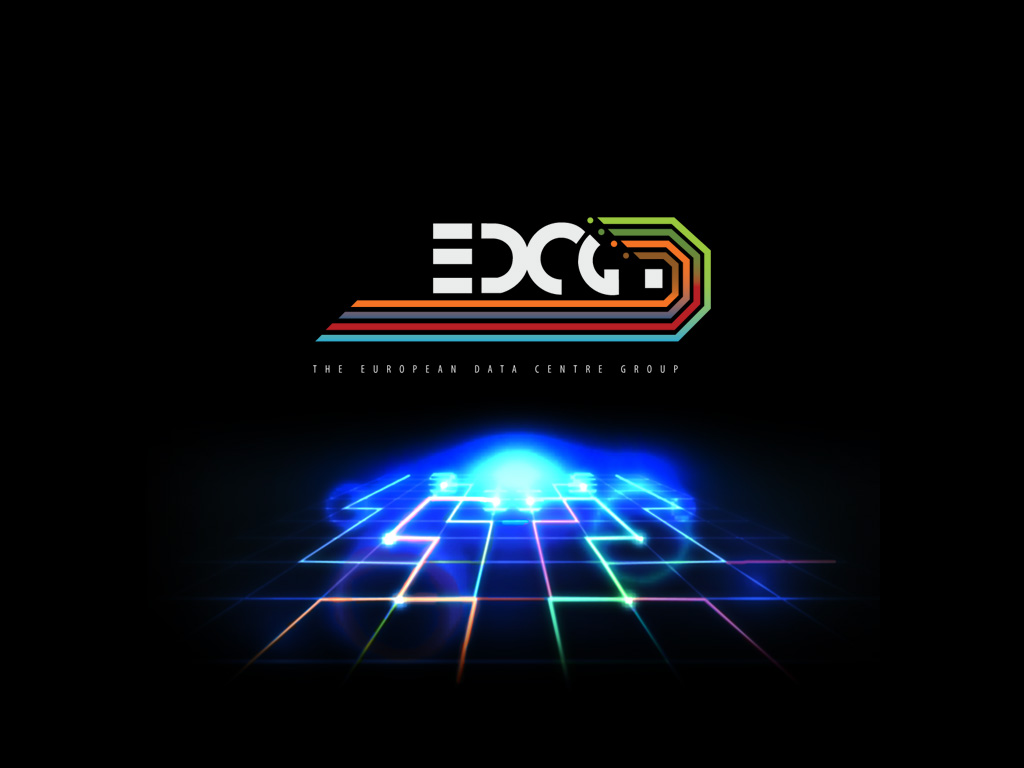
EDCG LOGO 2014/15EDCG Logo Designed by JAWilsonDesign

The EDCG logo was coloured in line with each data centre’s brand colours; each line is an individual data centre business surrounding the light grey square of the customers data. The E that was decided upon was three lines representative of servers in a rack space and it was also decided to extend the lines longer to give the impression of a more sleek smooth design that appeared to have some visual movement.

This logo , like the MigSolv brand, became the heart beat for the rest of the brand and after designing the logo my attention was drawn to the website design

Print Design

EDCG collatarel

The collateral design would utilise the colours from the various data centre brands whilst maintaining the dark grey and black background of the EDCG. Below is a double-sided service specification handout that could show the benefits and pricing to potential customers.


The Change Creative Triangle

Like What You See?

To discuss your project and see how we can help

Contact Us